
The right type(face): an introduction to typography for lawyers
BY Kristen Friend

LISTEN
This is part one in a three-part series covering typography for attorneys. This first installment is an introduction to typography, its use and why it is important. The next article in the series will discuss how lawyers can use typography in websites and online applications. Part three will discuss print.
What is typography?
Typography is the visual aspect of the written word. It can also be described as the practice of configuring type (text) for use in print or on the web.
Typography involves the use of typefaces. A typeface is a collection of fonts. The distinction between and typeface and a font is rooted in the long history of printing.
The long reign of the letterpress
A lot of rules and technical lingo surrounding the use of type have been handed down from the days of letterpress printing, spanning from the mid-15th century until the 19th century, and into the 20th century for books. In letterpress printing, printers arranged blocks of movable type into beds, applied ink and pressed the inked letters onto paper to produce documents.
In order to create the beds of type, a printer would need each individual letter in many sizes and weights. So, for example, one would need an “a” in Garamond 10 point bold and also in Garamond 14 point italic, and so on for every letter. Each of those size, weight and family combinations — like Garamond 12 point regular — were considered to be individual fonts. All of the fonts, in all their weights and sizes and faces together, made up a typeface.

Letterpress type. Image wikimedia.
Technically, typeface is still the correct term for a collection of fonts, like Garamond. However, since the need for the distinction is outdated, most people — even designers — now use the terms font and typeface interchangeably. (You will notice them used interchangeably in this article.)
Why care about typography?
Some people refer to typography an art, and indeed, well-designed type can be quite beautiful. However, the practice of visually arranging text is at its heart utilitarian. Type does not necessarily have to be pretty to serve its function. Ideally, in both print and web design, a good designer will create layouts in which type is both visually appealing and functional. But given a choice, function must win.
The degree of care put into typography can determine whether a project is successful. Good typography often goes unnoticed. It is similar to industrial design, like, for example the lighting used in a theater or gallery. When it is done right, it works naturally, but when done incorrectly it can ruin the whole experience.
The wrong font can make your firm look unprofessional or unappealing to your target client demographic. And poor typographic choices can make text difficult to read and cause strain for website visitors.
For example, review this paragraph with and without attention to white space.
System fonts, print fonts, web fonts, oh my!
System fonts
A system font, as its name implies, is one that comes installed with your computer's operating system. All machines, whether Apple and Microsoft, come with a set of typefaces, and for many, those fonts will be the only ones they ever use in their personal and professional lives.
There is, however, not really any excuse to use system fonts professionally. A single font can usually be purchased for $25 to $40. That puts the cost of purchasing the necessities (regular, bold and italics) at around $100 — a small price to pay for an item that will be used to represent your firm.
Most system fonts are desktop fonts, that is, they are designed to be used on a desktop and in printed documents. These fonts have OpenType features, which add a lot of flexibility and options when designing for print applications. And they have certain design characteristics that make them easier to read on a printed page, but not necessarily on a website.
Web fonts
A web font, on the other hand, is designed specifically for use online. Some web fonts only exist as such; they have been design exclusively for internet use. Others are modified versions of desktop fonts.
In the early days of the web, only system fonts were considered safe for use when designing web pages. This is because the html document is telling the browser to display text in a certain font, and the browser could only access the fonts that existed on each individual computer to do so. Just because you owned a font did not mean your readers did, so most web pages were limited to a few fonts common to both Mac and Microsoft operating systems, like Arial, Verdana, Georgia or Times.
Today, however, thousands of web fonts are available for use in web applications. Google has hundreds for free. These fonts can be accessed from public sources, and therefore browsers do not have to rely only on the fonts that are installed on an individual computer to display a pate.
Bottom line: There is no longer any excuse to use a font on a lawyer website that is not perfectly suited to the firm.
Print vs web
OpenType features are not the only thing that distinguish fonts generally used for print from those used online. Web fonts also share some design characteristics, including:
- More space between individual letters
- A taller x-height, which means the difference in height between the capital and lower case letters is reduced
- Less contrast in weights, making the thinnest part of the letter less thin and the overall letter a little thicker
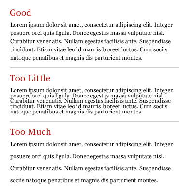
Here are a couple of examples:
The top font is optimized for print. The bottom is optimized for web. Photo: creativepro.com.

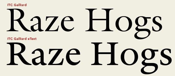
Georgia is optimized for web, Miller for print. Image: practicaltypography.com
Type that is being set for print can be easily manipulated in myriad ways. Changing the spacing between individual letters — to different amounts within the same word even — is quick and easy with layout software like InDesign. This same flexibility is not available when programming web pages. Even if you were to attempt it, the CSS required to control the page would be cumbersome and a burden on page speed; it would likely hamper your SEO efforts and push your pages down in search results. Therefore, web fonts have to have readability features, like letter-spacing, built in.
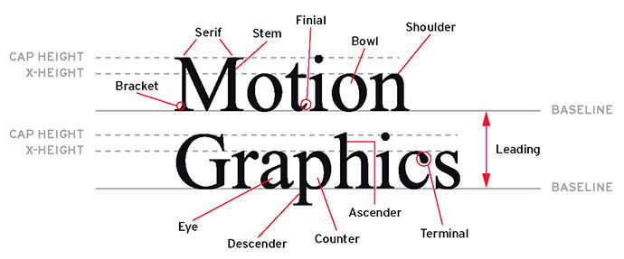
Type terms, visualized
Choosing a typeface
The typeface your firm chooses to represent itself online and in print will depend on your audience and your firm's brand personality. Typefaces help establish mood and feeling. There is no universal rule that all law firms must use a serif font (looking at you Trajan Pro) in their logos and letterhead and Arial on their websites. In fact, choosing an unexpected typeface can help your firm stand out in the right way if the decision is made with care.
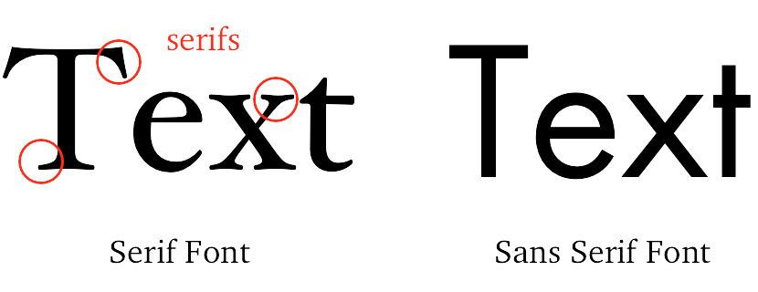
Serif fonts
A serif is the tiny little tail that sits on the ends of the letters of a serif font like Times. Serif fonts are easier to read — especially in print — because the tiny lines on each letter makes it easier for the human brain to perceive the letter. Without the serif, it actually takes longer for the brain to process the visual information and recognize each letter it is seeing. Many online magazines have converted to serif fonts. When displayed at the correct size on a monitor, they can be quite soothing to the eye and make it easier for people to read paragraphs of text.
The mood of most sans serif fonts is formal and traditional. (Not to be confused with professional.) They are cool fonts in the sense they they are restrained and reserved and can even in some cases be perceived as being aloof. They seem to be a natural fit for law firms, and in some cases they are — if formality and tradition are part of the firm's brand.
Sans serif fonts
Sans serif (literally “without serif”) fonts are round and smooth. For some time common wisdom held that sans serif fonts were easier to read online (they are at small sizes), and sans serif fonts were always recommended for body copy. However, monitor resolution has improved to the point that both serif and sans serif fonts can be used in website body copy without an issue, as long as the text is not too small.
The mood of most sans serif fonts is modern and relaxed. Sans serif fonts are very clean, and they lend themselves to designs that use a lot of white space. A bold sans serif font can be dramatic, while a thin version can be light and airy. Type written in a sans serif font can remain readable when it is very small, which is why it does well for use in taglines.
Silly fonts
Silly fonts, like handwriting, display, military or circus fonts, have no place* in attorney marketing materials. The right font can be attention-grabbing without being inappropriate. There are plenty of good typefaces, which are not widely distributed as system fonts, that will convey the right feeling without making you look unprofessional.
* There are no absolutes in design. Rules are made to be broken... sometimes.
Typography is not a topic to which lawyers likely give a lot of thought on a day-to-day basis. However, some basic knowledge about fonts and the role they play in creating documents, websites and print marketing collateral is helpful. Attention to small typographic details can boost the effectiveness of any written material.
For an in-depth look at typographic terms, see supremo.tv's interactive type terms site.
Stay tuned for part 2: Effective typography for lawyer websites.
LATEST STORIES
MORE STORIES

Google has Changed their Mind About AI Generated Content
Their change in terms essentially amounts to, “Yes, you can use AI tools to help create quality content but it had better be good.”

What Makes a Great Law Firm Marketing Director?
In an ever-changing legal landscape, an exceptional Law Firm Marketing Director stays ahead of the curve. They adopt a visionary perspective to navigate through intricate legal landscapes and drive the firm’s marketing initiatives. This involves identifying market trends, predicting client needs, and planning innovative marketing strategies to secure a competitive edge.

How Law Firms Can Effectively Use Press Releases
Press releases allow law firms to share their successes, announce new hires or promotions, and position themselves as thought leaders in their respective practice areas. In this article, I will share best practices for writing a great title, writing a great summary, and telling your story in a meaningful way, as well as provide scenarios…
