
The Ultimate UX Writing Guide
BY Hannah Felfe

LISTEN
Your team has spent countless hours researching, generating ideas and writing content to produce valuable leads that keep your firm growing. However, in the midst of content creation, there is something easy to overlook: the user experience.
User experience can quickly become degraded if writers fail to understand the way readers digest online content.
Website visitors are not meticulous readers. If visitors cannot easily scan a page, then they are likely to look elsewhere. This translates to leads lost due to poorly designed content.
The transition from print to online content must be conscious. While many people reading a book or print magazine will absorb each word, research by the Nielsen Norman Group shows that only 16 percent of online users will read web content word for word.
Print consumers pay for their reading. Most often people do not pay to read blog posts or press releases about your law firm, making the content seem less valuable, or disposable. The reader must be compelled to continue. There is no promise that online content will be read.
Marcus Harjani, Co-Founder of FameMoose, explains: “Think of your site as an extension of your office . . . A welcoming and accessible site only magnifies the ability of your firm to provide quality legal services.”
See through readers’ eyes and analyze your own consumption of online content. Online users tend to scan, bouncing from one point to the next in a hopeful attempt to land on relevant information.
In fact, the average visitor will only read 20 to 28 percent of the words on your site, according to research done by the Nielsen Norman Group.
You can try to bring this number up by optimizing your users’ experience. Here’s how.
Use readable language
“The key to creating engaging content for lawyers is to tell a story,” says Ari Kaplan, a lawyer and legal industry analyst with Ari Kaplan Advisors. “Lead with an anecdote that will capture the reader’s interest at the outset and allow him or her to easily follow a roadmap throughout the article.”
According to statistics from the Clear Language Group, the average U.S. citizen reads at a seventh to eighth grade level. Even Americans with higher levels of education do not want to unpack heavy prose. Improving your website’s readability will expand your audience and comfort your users. With online content requiring simplicity to combat reader impatience, precise language is key. Write content internet users will read by doing the following:.
Limit long sentences. Shortening sentences can lower reading level. Shorter sentences are easier to follow. They create a simpler flow and are more compact, eliminating fluff.
Limit paragraphs to one subject. With one subject per paragraph, the reader takes less time to focus on an idea and more time to absorb information. This also is important for users that tend to skim content.
Use the active voice. Passive voice complicates writing. Active voice clarifies the subject and the verb of the sentence, improving readability.
Create scannable content
Research from the Nielsen Norman Groups indicates that 79 percent of users will scan a webpage. Therefore your firm’s website should work to ensure your readers can absorb the necessary points. The overall visuals of your content will determine how easily a person can read it. To ensure scannability of your website, add:
Highlighting. Though only powerful when used minimally, highlighting text, for example through pull-quotes, can draw readers’ attention to important points. It can also break up seemingly long text of the same type.
Sub headers. Sub headers divide text into points. They make content easier to understand and faster to read. Avoid clever subheads; keep them concise.
Bullet points. Readers love to pick and choose information, and bullet points are perfect for this. They break up the prose to make content easier to digest.
White space. When text is spread all the way across the page with no interruption, it appears daunting. With added white space on either side of the text, the page will appear more organized. The optimal line length for a line of text is between 50 and 60 characters.
Conclusion first. Novels and academic writing adheres to the pyramid presentation, where a point is made in the beginning and then developed over time toward a conclusion. For website content your firm should assume the upside down pyramid instead.
Make information compact
Do not overload your readers with detail. Your readers may have some base knowledge of your subject matter. Avoid adding too much information by understanding who your audience is.
Online content often tends to be repetitive. This could in part be a holdover from old SEO techniques, when search engines rewarded reiteration. This is no longer the case, and unnecessary repetition can annoy and deter your reader.
Another way to make your writing more concise is to avoid adverbs. Occasional use of adverbs is acceptable, but too many adverbs deter from the point. Consider using more demonstrative verbs instead.
Pay attention to design
The aesthetic of your website is as important as the content published on it. To strengthen your page layout, start by picking user-friendly, readable fonts.
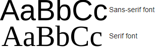
Some fonts are more commonly used for print, some for web and some fonts should never be used in professional applications. Sans serif fonts, are easier on the eye for headlines and sub heads online. Sans serif fonts also work well for paragraph text copy, however serif fonts can be used in the body of a website as well.
Many content-heavy online publishers, particularly prolific news outlets like The New York Times, The Atlantic and NPR, use serif fonts for their articles. Serif fonts have proven easy to read in the context of long, context rich articles.
Furthermore, the fonts you choose should adjust to your readers’ devices. Use percentages or em units instead of fixed pixel definitions so your copy will adjust to your users’ browser settings and screen resolution.
Once you have picked your fonts and established a baseline em unit, examine your background and your text together. More contrast improves readability. Do not use too many busy background images that detract from your text. If you are using a background image, make it simple, or blur it to make text easier to read.
Finally, remember to supplement your text with graphics. Not only do readers process images quicker than they process words, but graphics break up the text and help shorten reading time.
With user-experience oriented content, you will be able to appeal to even the most hesitant visitors.
LATEST STORIES
MORE STORIES

What Makes a Great Law Firm Marketing Director?
In an ever-changing legal landscape, an exceptional Law Firm Marketing Director stays ahead of the curve. They adopt a visionary perspective to navigate through intricate legal landscapes and drive the firm’s marketing initiatives. This involves identifying market trends, predicting client needs, and planning innovative marketing strategies to secure a competitive edge.

How Law Firms Can Effectively Use Press Releases
Press releases allow law firms to share their successes, announce new hires or promotions, and position themselves as thought leaders in their respective practice areas. In this article, I will share best practices for writing a great title, writing a great summary, and telling your story in a meaningful way, as well as provide scenarios…

Google’s John Mueller Warns Fluff Content Can Harm Your Law Firm’s Whole Site
By heeding John Mueller’s warning and focusing on producing valuable, informative content for your audience, you can avoid the pitfalls of fluff content and improve your website’s overall search engine performance.
