
Get Ready for Google’s Mobile-First Indexing
BY Ryan Conley

LISTEN
For over a year, Google has warned of an upcoming fundamental change to the way it ranks websites, called “mobile-first indexing.”
The change is very important, and websites that are not prepared could take a big hit in search result rankings.
The good news is that getting ready is not difficult and most well-designed sites are already well-positioned for the update.
What is the mobile-first index?
Many websites serve up different versions of a given page depending on the type of device accessing the page. Smartphones typically have smaller screens, slower processors and slower internet connections than desktops and laptops. A page specifically designed for a mobile phone will typically leave out non-essential content for faster loading and will be formatted for the smaller screen.
Google’s determination of how highly to rank a web page in search results is typically made using the desktop version of a website if more than one version of it exists. For much of the history of the internet, desktop computer usage has dwarfed mobile device usage, so this made sense.
Today, however, more web searches are conducted on smartphones and other mobile devices than on desktop and laptop computers. It is possible for a mobile page to have less content than a desktop page and to thus be ranked too highly from the perspective of a mobile user under the current ranking system.
Google has therefore concluded that they must at some point begin favoring the mobile-specific pages when determining rankings.
In November, 2016, Google announced that at some undetermined future time, its algorithms would switch to using primarily the mobile version of a website to determine how to rank its pages. This is mobile-first indexing.
The exact date of the change has not been revealed, and it may not happen all at once. Google wants to avoid large numbers of sites suffering big drops in rank and is allowing plenty of time for sites to prepare. However, the company had already begun limited experiments with mobile-first indexing at the time of last year’s announcement.
What needs to be done?
Setting aside the exact date as to when mobile-first indexing will become Google’s standard, the time to make sure your site is ready is now. In the blog post announcing mobile-first indexing, the company lays out two strategies for this. The first is to use one of two flavors of future-proof web development; the second is a series of technical fixes aimed to make sure a mobile site is indexed properly by the search engine’s web-crawling bots.
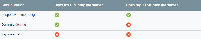
Responsive web design (RWD) is a system wherein sites send the same HTML code to all visitors regardless of their device type or screen size. Within the HTML is a design language called Cascading Style Sheets (CSS), which is used to control how the page is rendered based on the screen size. In addition, page elements are sized relative to the total page width rather than in absolute terms, such as number of pixels.
Dynamic serving is a an alternative to RWD wherein the web server, upon receiving a request for a page, requests information from the browser about the device’s screen size and delivers one of various versions of the site depending on the answer.
Because both responsive design and dynamic serving use a single URL for a given page, Google’s bots will have no trouble finding and indexing all of their content. Sites built with these methods are ready for mobile-first indexing; nothing more needs to be done. An alternative system, however, requires some extra care.
Separate URLs, like dynamic serving, uses different pages for different devices, but this system also locates these pages at separate web addresses, or URLs. You can spot these sites by the “m.” preceding the URL when you view them on your smartphone. Facebook is a good example. Go to facebook.com in your phone’s web browser and you’ll be redirected to m.facebook.com. The “m-dot” prefix indicates a mobile-specific site which is dramatically simplified for quick loading and ease of reading. This is why the separate URL system is also called “m-dot” web design.
Sites that use separate URLs must be sure to adhere to a number of technical guidelines to ensure that Google’s bots discover and properly index the mobile versions of their pages. Otherwise, under the mobile-first indexing regime, the site could be judged on its desktop version’s usability on mobile devices, which could be quite problematic. These guidelines are spelled out in the Google blog post referenced above.
Should everyone go responsive?
Google recommends using responsive web design, for a number of reasons. Pages made using a single responsive design are easier to maintain than separate versions for different devices. Additionally, responsive design ensures consistent content, user experience and aesthetics.
Note that there is nothing inherently wrong with separate URLs — at least not from a search ranking perspective. Google will not demote a page or site’s rank simply because it redirects mobile users to mobile-only pages. In other words, if your firm has an m-dot site, there is no need to panic. You should, however, take steps to ensure your m-dot site is indexed correctly. Ask your web developer or SEO firm for a full report on your site’s preparedness for mobile-first indexing.
Indexing is not everything
Preparing for mobile-first indexing is partly about making sure your site is indexed and ranked properly. But it is also about good design. Regardless of what system a site uses for displaying on mobile devices, it must be fast-loading and easy to navigate.
Even more importantly, sites must be full of high-quality, fresh content to rank highly. This is true now and will remain true in a mobile-first regime. A website that contains stale content of little use to anyone will never rank highly no matter how well-tailored it is to various devices.
Invest not only in preparing for mobile-first, but also in regularly delivering well-written, useful, authoritative legal information that is indispensable to your target audience.
LATEST STORIES
MORE STORIES

Google has Changed their Mind About AI Generated Content
Their change in terms essentially amounts to, “Yes, you can use AI tools to help create quality content but it had better be good.”

What Makes a Great Law Firm Marketing Director?
In an ever-changing legal landscape, an exceptional Law Firm Marketing Director stays ahead of the curve. They adopt a visionary perspective to navigate through intricate legal landscapes and drive the firm’s marketing initiatives. This involves identifying market trends, predicting client needs, and planning innovative marketing strategies to secure a competitive edge.

How Law Firms Can Effectively Use Press Releases
Press releases allow law firms to share their successes, announce new hires or promotions, and position themselves as thought leaders in their respective practice areas. In this article, I will share best practices for writing a great title, writing a great summary, and telling your story in a meaningful way, as well as provide scenarios…
