
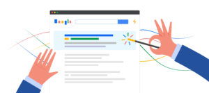
SEO: Bigger, more beautiful and with fewer words
BY Jason Bland

Over the last decade, websites have truly embraced words, generating long pages of content to feed to their marketing deity, Google. More words, better words, words high upon the page, words low in the footer, words everywhere; to please the Google in greater fashion, webmasters thought, “We will link these words to many pages, and many places, and write more words so that we may link to these words from other words, until we have created a vast sea of words within our website. Then, the Google will be pleased.”
At first, these wordy sites seemed to be doing it right. They ranked high, they ranked fast, and they ranked well. For several years, design seemed to be pushed aside to make room for words. It’s almost like Google released a decree which stated, “Give us your wordy, your ugly, your pages void of style, and we’ll show them the top of Google Search Mountain.”
But over the last four or five years, design has been making a comeback. Eyes parched by a monochromatic sea of words began to once again taste the visual martini that is pictures, graphics, and concise points. By this time next year, properly developed and optimized websites will be bigger, better designed, and loaded with graphics. They will look fantastic and won’t face backlash from Google, Bing, or any other search engine worth mentioning.
We have seen this coming for quite some time. The increasingly popular blogging platform Tumblr has made its mark on the web by putting a heavy emphasis on imagery within blog posts. Social network Pinterest made images the focal point of their network with virtual pinboards showing users’ interest through pictures and graphics instead of the still-text heavy walls used by LinkedIn, Twitter, and other social networks.
Of course, great content is still a major component of a well-optimized website. But with the many features supported by HTML 5, content and graphics can peacefully coexist. For example, your law firm could post a detailed page made up of 2,000 words. Sections of the page could be toggled to contract or expand as the user wishes to read more or less. If the user does not wish to see more of the content, it remains hidden within its well-designed surroundings.
These effects will become more advanced and offer more user control as HTML 5 evolves. Through Rich Snippets, you can tell Google what content items within a page are most important, thus allowing you to not lose content value within the page.
The new ways of displaying text have opened the door to a graphic-rich user experience - one that is not obnoxious like the late 90’s infusion of animated Flash websites, but instead is clean, attractive, intuitive, adds to the user’s experience and makes finding information easier. All of this makes the experience more enjoyable, and your audience will start expecting it. As people get used to the new, graphic-rich web, your law firm is going to have to deliver on their expectations.
A Few Examples
- Rather than just having a list of practice areas, show a practice-area list that dynamically populates options based on the search query the visitor used to get to your website.
- Instead of having only content-based information (which is still very important), include infographics to explain your practice areas and legal process.
- Offer video explanations as supplemental content to a sub-page, rather than making the video a center piece of a website.
If you are planning a redesign, it will be important to have a lot of content, but also have that content easily organized and tucked away for easy user access. The future of your website is not exclusively graphic, nor is it solely textual. By this time next year, many websites will be delivering a healthy balance of both, presenting a well-balanced design that makes their visitors feel comfortable, informed, and ready to talk.
When updating the online face of your firm, think about making things bigger and developing captivating textual and visual content, because your visitors are getting used to seeing a web that is big, attractive, and concise.
LATEST STORIES
MORE STORIES
Google’s March 2024 Broad Core Update is Fighting Spam and Deleting Low Quality Content
Google has long been the go-to search engine for billions of users worldwide, serving as a bridge between users and the vast ocean of information available on the web. Recognizing the importance of maintaining the integrity and quality of search results, Google has continually evolved its search algorithms and policies to combat spam and low-quality…

Insider Trading Case Highlights Work-From-Home Risks for Lawyers
The recent insider trading charge against the husband of a BP employee, who allegedly capitalized on confidential information overheard during his wife’s work-from-home scenario, casts a spotlight on the burgeoning confidentiality risks in remote work settings. Tyler Loudon, the spouse of a BP employee, faces insider trading charges in the U.S. for allegedly using confidential…

How to Get Local News Outlets to Cover Your Law Firm’s Big Case
Reaching out to local news outlets is a strategic move for law firm marketing directors aiming to enhance their firm’s visibility and establish its members as thought leaders in their practice areas. This article will guide law firm marketing directors through the process of engaging local news outlets to cover new cases, offering practical advice…