
Why Should Lawyers Care About Responsive Design?
BY Tami Kamin Meyer

People visit law firm websites on a variety of devices, the sizes of which range from a small smartwatch to a generously sized television monitor. In order to maximize user experience, websites need to be constructed to accommodate those broad ranges and ensure each interaction with the site as is easy as possible.
Enter responsive design, “an approach to website design that aims to provide the best viewing experience for the visitor regardless of the type of device they are using — anything from a small mobile phone, through a desktop, up to a television-based browser,” says Tom Murzenski, Chief Technologist with Impel Digital in Northern New Jersey.
When a website layout is responsive, pages will naturally adapt to the size of the screen on which they are being viewed. You can recognize a website that utilizes this technique as you change your browser size on a desktop. If the content adjusts to a browser window of any size, the site is most likely responsive.
According to Igor Ilyinsky, founder of FirmWise, a Chicago-based web design and development firm, responsive design has become the standard in the industry. “Responsive design does not mean a site is only mobile-friendly but also that it responds to any device of varying dimensions,” says Ilyinsky.
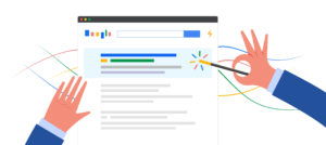
Google’s attitude towards responsive design
While Google recommends website owners implement responsive design over other methods for making pages mobile-friendly, it has never stated that any specific method will receive preferential treatment in rankings. Despite these reassurances, some SEO professionals have concluded from their own experiences that Google’s algorithm tends to rank responsive pages higher in results than those with mobile-specific urls.
Responsive design can help boost pages in search engine results, according to Linda Sorrells-Smith, a project manager with Haley Marketing in Buffalo.
Sorrells-Smith has found implementing responsive design beneficial to clients. “If your site is responsive, it’s more likely to score higher than a web site that is non-responsive,” she says.
There are at least two ways to check the mobile-readiness of a web site. Google offers a simple testing site, found at https://search.google.com/test/mobile-friendly. Another way to determine a site’s mobile-readiness is by looking for its hamburger menu in the top left-hand corner of the site’s home page when it appears on a mobile device, says Sorrells-Smith.
First impressions are important, especially online. “Web sites should be easy for the visitor to use and find information,” she says.
“Google does not prefer responsive web design, it does prefer your web site function well on a mobile device, so it has a variety of tools to test its usability on a mobile device. Those tools differentiate between responsive or adaptive design,” says Ilyinksy.
Ensuring smartphone and desktop users have the same good experience when visiting your website is becoming increasingly important. The number of people using mobile devices to access the internet has exploded since 2009. According to Stastista, less than one percent of all visits to websites that year were performed using a mobile device. However, by the end of 2017, it was estimated that more than half of all web site visits were accomplished from a mobile device.
The type of device visitors use to access a page is often linked to the information they are seeking. For example, when a mobile device is used, the visitor is usually looking for quick information, like a firm’s phone number, hours or address. That type of quick hit information is ideal for smaller, hand-held devices, while laptops and desktops are more conducive to research and in-depth topic investigations.
Should lawyers care about responsive design?
Although the code used to implement responsive design is a back-end aspect of a website, meaning not something obvious a user will see when they first visit a site, it is imperative for a site to utilize it, says Ilyinsky.
“Lawyers should care their website is mobile-friendly. Responsive design doesn’t mean a site is only mobile-friendly but that it also responds to any device of varying dimensions.”
Murzenski agrees. “Mobile-friendliness is a ranking factor, so if a lawyer cares about their search engine ranking, and they should, they should care about responsive design. This is true even if the majority of your customers are not on mobile devices, as in corporate law, for example,” he says.
“Responsive design is becoming so ubiquitous that if your site is not responsive it will soon look old-fashioned and unmaintained,” he says.
Ilyinksy cautions lawyers not to be lazy when it comes to testing how their firm’s site looks on one device versus another.
Not surprisingly, all three experts agree it is best for lawyers to hire a professional web designer to create or update a law firm web site.
“If you want a high quality product, be sure your web designer does not does not use templates. Your web site is supposed to differentiate you from your competition. If not, you might as well use a website design template from the Internet that comes pre-formatted,” he says.
Why responsive design matters
In addition to helping your pages rank well in Google’s search engine results and ensuring pages easily adapt to the device used to view a site, using responsive design tells another story.
“Using responsive design tells how far a developer went not only to accommodate various devices but also the various, different orientations and uses of those devices,” says Ilyinksy. He notes how a page will look distinctly different on a 27-inch monitor with retina display than a four-inch long mobile phone screen. Using responsive design tells your visitors that you care about these different experiences.
Ilyinsky says he even goes to Apple stores to visit a sites his team has built to see how they look on large monitors.
What can you do to make your responsive layouts work?
You know how responsive design can help with search marketing; what can you do to make sure your responsive are effective?
1. Optimize images.
As layouts adapt to smaller screens, images are often replaced with text or solid colors to help reduce page size. Any images that do still display should be as small as possible so that pages can load quickly. Smush Image is a popular WordPress plugin that optimizes images for fast loading. For those who do not wish to use a plugin, compressor.io is a free online image compression engine that significantly reduces file size.
2. Plan your forms.
Attorneys need to collect a lot of information from clients. It can be tempting to try to collect much of that information during the lead intake process. However, every additional form field presents a barrier for users who want to contact you. That is not to say visitors will not fill out forms; they will, if you choose your form fields wisely.
Request only information that you need to begin a conversation with a potential client. If you ask for information beyond contact details and a basic summary of the issue, make sure all fields are easy to interact with, error messages are obvious, and that visitors are happy to turn over the data you are asking for.
3. Pay attention to typography.
The way words are physically displayed on a page has an impact on readability and conversions, particularly on small screens. The rule of thumb is that your font size should be at least 16 pixels, or 1em, on a mobile device. If your target clients are members of an older demographic, you may want to increase your font size beyond this recommendation to ensure visitors can comfortably read your pages.
Additionally, make sure each of your lines of text has enough space in between them so that the eye easily flows from line to line. Too little, and the type is crowded. Too much, and it floats apart. Both issues make paragraphs difficult to read. Finally, break up content with headings and sub headings of different sizes to make sure visitors can easily scan through it on all devices.
4. Design with column patterns.
Responsive design has been around long enough that internet users are used to seeing columns behave in certain ways. For example, in a mostly fluid pattern, columns on the right will flow onto the next level of a page to sit below columns on the left as the screen gets smaller.In a column drop pattern, columns will stack one on top of another as the browser window shrinks. These are familiar patterns and using them helps visitors navigate your content as it adapts to devices in predictable ways.
5. Carefully size buttons and links.
Mobile users face two challenges when navigating links. Hover effects, which are usually easy to see on a desktop as your mouse wanders naturally over the page, do not appear on mobile devices. Additionally, buttons that are easy to click with a mouse may be less easy to tap with finger.
If a visitor cannot see your links, conversions will be negatively affected. And few things are more frustrating to mobile users than trying to click on one link and accidentally tapping another, forcing them to click back and try again to get to the right page. For maximum usability, all links must be obvious to users and be large enough and have enough space around them that they are easy to tap with even the clumsiest of fingers.
6. Employ minimalism and visual hierarchies.
Pages, especially those that contain a lot of content, must be organized so that they are easy on visitors’ eyes and make important information easy to find. This is especially important on small screens. Group topically relevant items together and break long paragraphs up into shorter ones. People tend to read only a headline and one or two sentences of a paragraph before moving on; make those elements your most compelling.
White space is also a powerful design tool. It lets people’s eyes rest, provides a sense of calm in a sea of otherwise distracting stimuli, and contributes to a feeling of distinction and value. White space can be used to break up content naturally and help lead visitors through a page.
Remember, good responsive layouts adjust in ways that a familiar to users, making the transition from device to device as seamless and user-friendly as possible.
Kristen Friend contributed to the writing of this article.
LATEST STORIES
MORE STORIES

How to Create Your Law Firm’s First Video
Whether you’re starting a TikTok channel, boosting your YouTube channel, or upgrading your website, video content can help make your future clients feel comfortable talking to you and your staff. For law firms, crafting an engaging and informative video can significantly enhance visibility and client engagement, plus open the doors to other opportunities like webinar…
Google’s March 2024 Broad Core Update is Fighting Spam and Deleting Low Quality Content
Google has long been the go-to search engine for billions of users worldwide, serving as a bridge between users and the vast ocean of information available on the web. Recognizing the importance of maintaining the integrity and quality of search results, Google has continually evolved its search algorithms and policies to combat spam and low-quality…

Insider Trading Case Highlights Work-From-Home Risks for Lawyers
The recent insider trading charge against the husband of a BP employee, who allegedly capitalized on confidential information overheard during his wife’s work-from-home scenario, casts a spotlight on the burgeoning confidentiality risks in remote work settings. Tyler Loudon, the spouse of a BP employee, faces insider trading charges in the U.S. for allegedly using confidential…